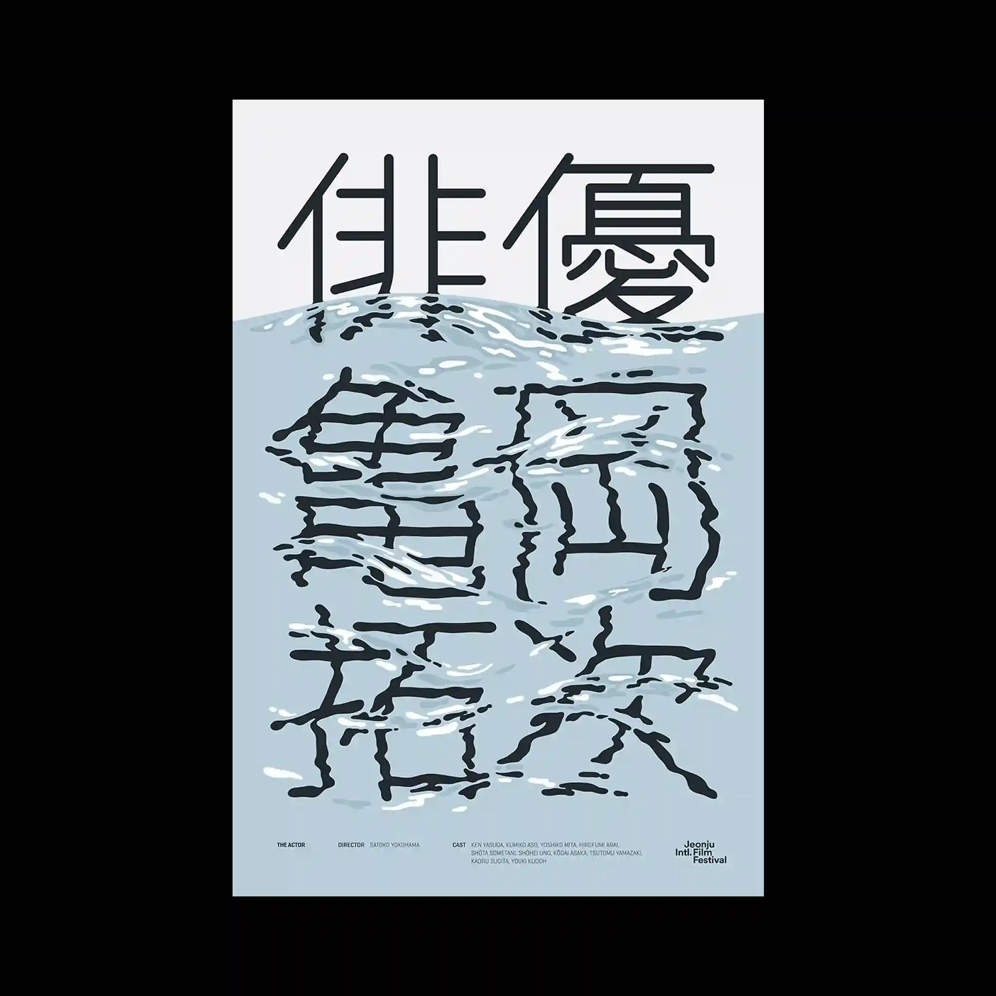
The poster divides its visual space between solid black typography above and water-textured typography below. The lower half appears submerged, with wavy highlights mimicking a rippling water surface. The juxtaposition of dry solidity and liquid distortion creates a duality of presence. The restrained palette of black, gray, and pale blue enhances clarity and impact. It conveys a quiet but striking visual rhythm.
상단은 검정 고정된 글자, 하단은 물결 같은 질감의 글자임. 아래쪽은 물에 잠긴 듯 파도 하이라이트 표현됨. 단단한 구조와 유동적 왜곡이 대비 이룸. 흑백과 옅은 파랑 조합이 깔끔함. 절제된 리듬감이 화면 강조함.
海报的上半部分为坚实的黑色字体,下半部分则呈现出带有水纹质感的文字。下方似乎沉入水中,带有波浪般的高光。坚硬与流动的并置营造出二元感。黑、灰、浅蓝的克制配色增强了清晰度与冲击力。整体呈现安静却鲜明的节奏感。