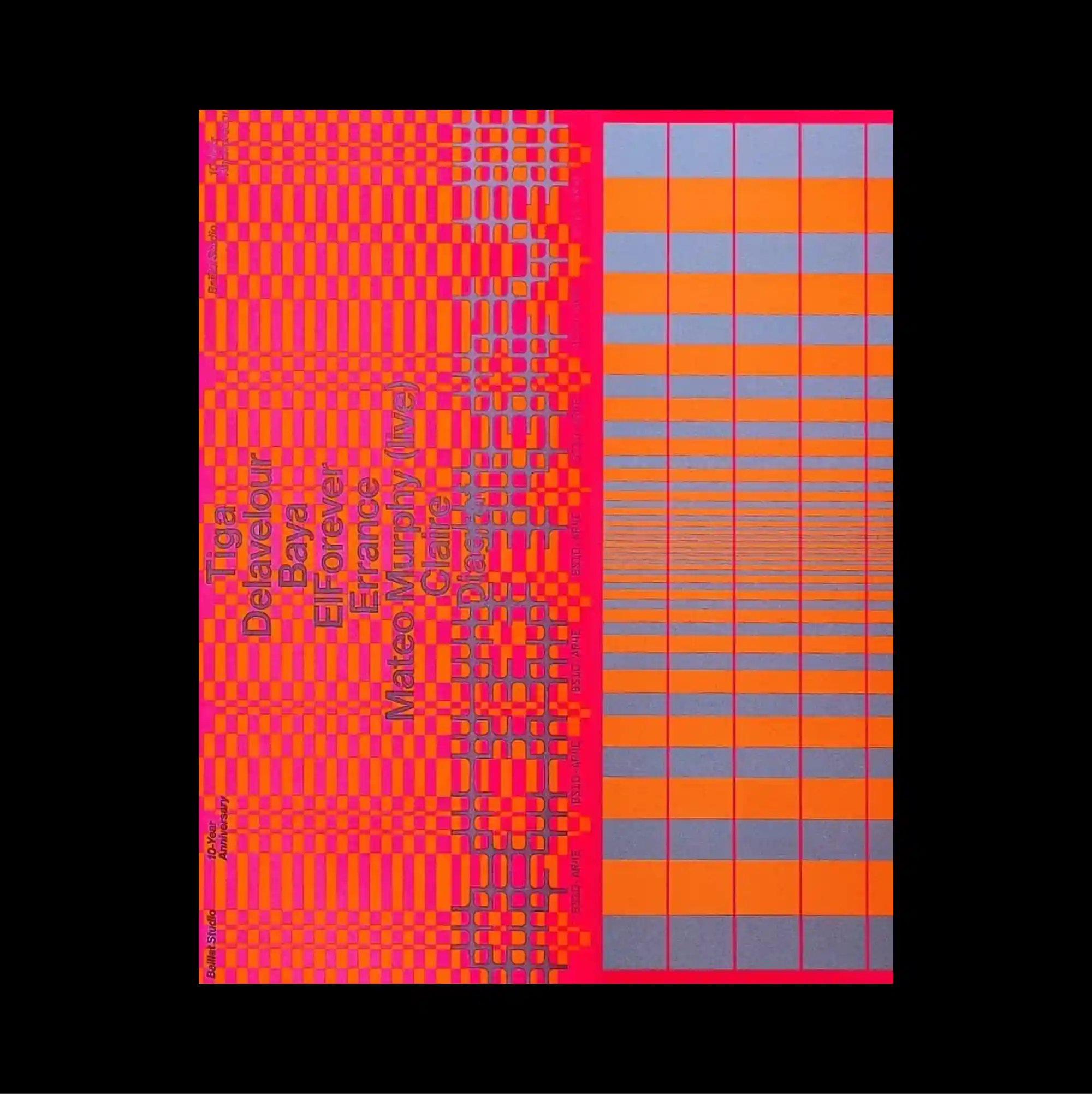
The design is divided into strongly contrasting color and image zones, using large rectangular fields to establish a clear structural hierarchy. Repeated words and characters accumulate into a patterned surface, allowing typography to function simultaneously as information and texture. A vivid pink-and-orange lattice fills the left half with repeated vertical wording, while the right side shifts into a precise stepped grid of blue, gray, and orange horizontal bars. Bold color contrasts and abrupt shifts in scale produce an energetic graphic rhythm that remains legible despite the density of the elements.
큰 직사각형 색면과 이미지 영역을 강하게 대비시켜 분할하고, 이를 통해 명확한 구조적 위계를 형성함. 반복되는 단어와 문자가 패턴형 표면으로 축적되어 타이포그래피가 정보와 질감의 역할을 동시에 수행함. 선명한 분홍색·오렌지색 격자가 반복 세로 문구와 함께 왼쪽 절반을 채우고 오른쪽은 파란색, 회색, 오렌지색 가로 막대의 정밀한 계단형 그리드로 전환됨. 강한 색 대비와 갑작스러운 크기 변화가 요소가 많아도 읽힘을 유지하는 활기찬 그래픽 리듬을 만들어냄.
设计以强烈对比的色块与图像区域进行分割,并利用大面积矩形建立清晰的结构层级。 重复的词语与字符累积成图案化表面,使文字同时承担信息与纹理两种作用。 鲜艳粉橙格网结合重复竖排文字填满左半部,右侧则转为由蓝、灰、橙横条构成的精确阶梯式网格。 强烈色彩对比与突变的尺度形成充满能量的图形节奏,即使元素密集仍保持清晰可读。