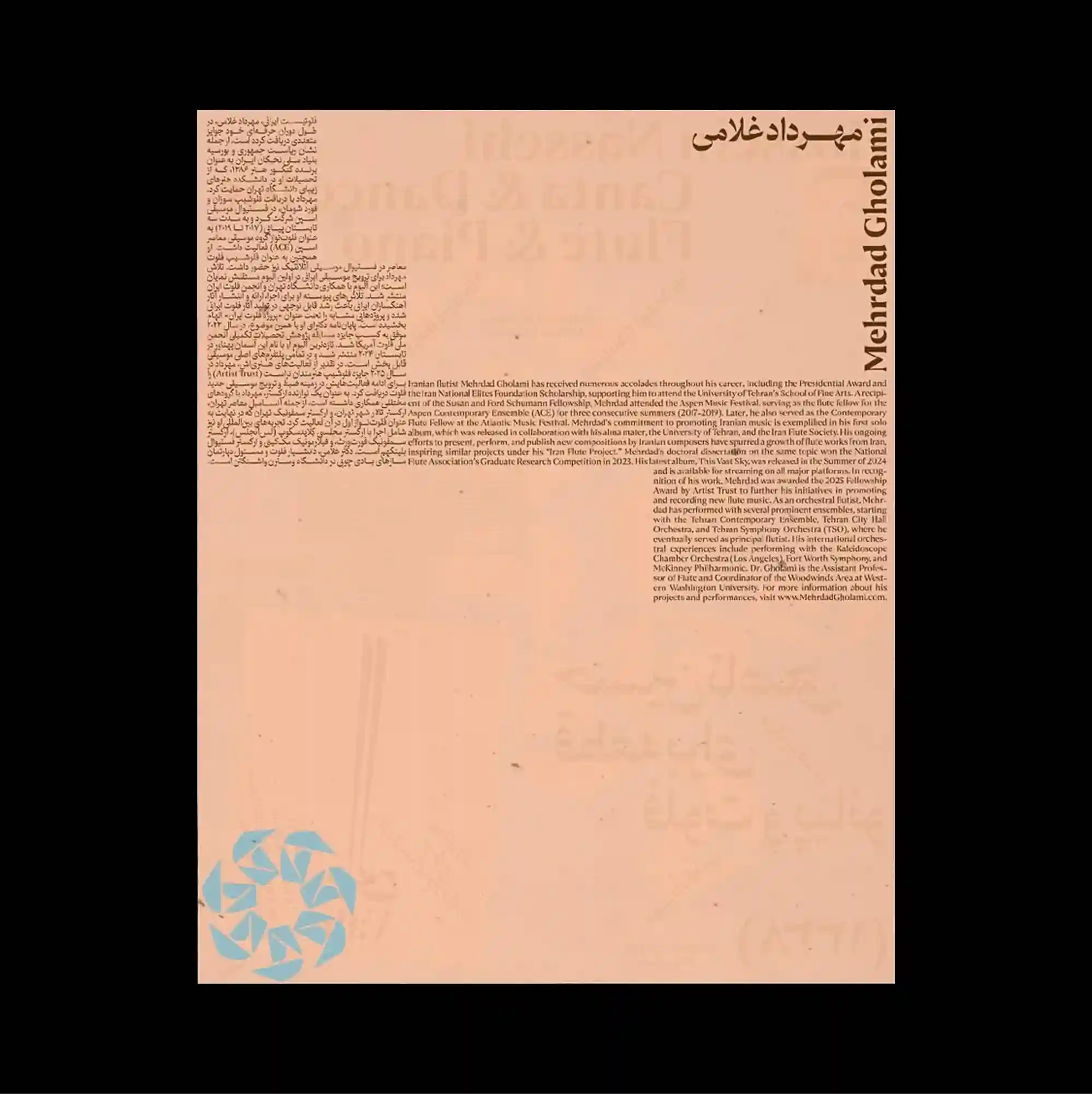
The layout is deliberately sparse, placing only a few compact elements across a broad open field so that distance and scale become active parts of the composition. Narrow columns of small sans-serif type establish a controlled rhythm, while occasional larger words interrupt the grid and create focal points. Dense text gathers along the upper and left areas of a pale peach sheet, leaving a broad empty center and lower field interrupted only by a turquoise geometric symbol near the bottom. Generous empty space and restrained detail create a quiet composition in which small shifts of placement become visually significant.
의도적으로 비어 있는 레이아웃 안에 소수의 작은 요소만 넓게 떨어뜨려 배치하며 거리와 크기 자체가 구성 요소로 작동함. 작은 산세리프 텍스트를 좁은 열로 정렬해 통제된 리듬을 만들고, 간헐적으로 등장하는 큰 글자가 그리드를 끊으며 초점을 형성함. 옅은 복숭아색 페이지의 상단과 왼쪽에 조밀한 텍스트가 모이고 넓은 중앙과 하단은 비워 두되 아래쪽의 청록색 기하 심볼 하나만 이를 끊음. 넓은 여백과 절제된 디테일 덕분에 작은 위치 변화까지 중요하게 느껴지는 조용한 구성이 형성됨.
版面刻意保持疏朗,仅将少量紧凑元素分散在大面积开放空间中,使距离与尺度本身成为构图的一部分。 小号无衬线文字以窄栏排列形成克制节奏,偶尔出现的大字号词语打断网格并形成视觉焦点。 密集文字集中在浅桃色页面的上方与左侧,大面积中央与下部留空,仅由底部附近一个青绿色几何符号打断。 大量留白与克制细节营造安静构图,使细微的位置变化也具有明显视觉意义。