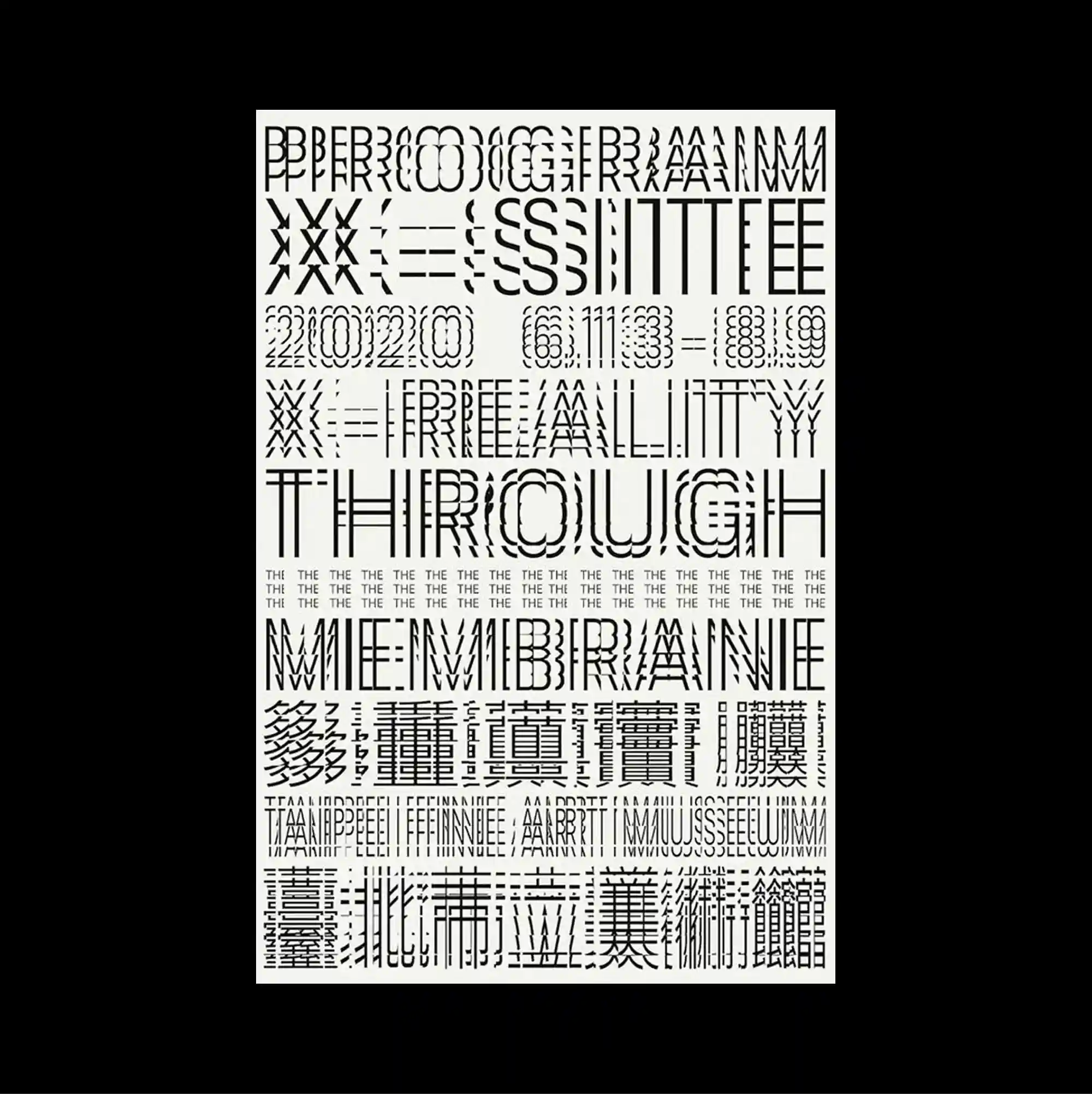
The entire surface is treated as a dense information field, with numerous small units packed closely enough to form an almost continuous visual texture. Letterforms are stretched, distorted, cropped, or rotated until the typography begins to operate as an abstract graphic material. The page is packed with repeated experimental alphabets, bars, grids, and compressed letter patterns that vary in density from row to row while remaining entirely monochrome. The compressed layering and hard contrasts produce a dense industrial character, with information behaving almost like a physical surface.
수많은 작은 단위를 촘촘하게 배치해 페이지 전체가 거의 연속적인 시각 질감처럼 읽히는 고밀도 정보 영역으로 구성됨. 문자 형태를 늘이거나 왜곡하고 잘라내거나 회전시켜 타이포그래피 자체가 추상적인 그래픽 재료처럼 작동하게 함. 반복되는 실험적 알파벳, 막대, 그리드, 압축 문자 패턴이 페이지를 가득 채우고 행마다 밀도가 달라지지만 전체는 완전한 흑백으로 유지됨. 압축된 중첩과 강한 대비가 조밀한 산업적 성격을 만들며 정보 자체가 물리적인 표면처럼 느껴지게 함.
整个表面被处理成高密度的信息场,大量微小单元紧密排列,几乎形成连续的视觉纹理。 字形被拉伸、扭曲、裁切或旋转,使文字本身逐渐成为抽象的图形材料。 重复的实验字母、条带、网格与压缩字形图案铺满页面,各行密度不断变化,但整体始终保持纯黑白。 紧密叠层与强硬对比形成浓厚的工业感,使信息本身几乎像实体表面一样存在。