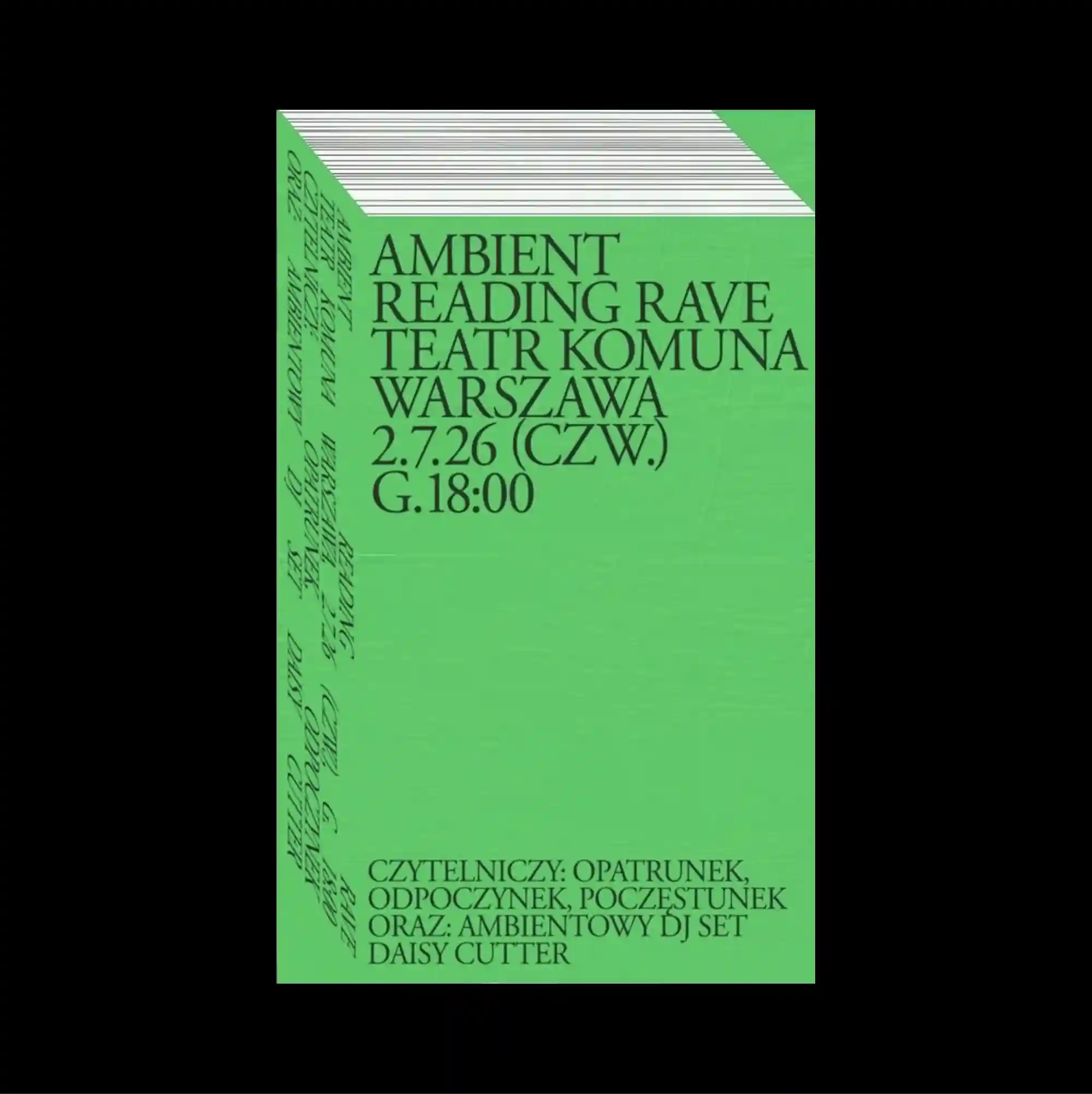
A centered composition leaves a substantial amount of open space around the main elements, allowing a small cluster of imagery and type to carry most of the visual weight. Serif and sans-serif styles are mixed with thin rules and compact captions, producing a layered hierarchy through changes in weight, width, and alignment. A flat bright green field is dominated by several large black serif lines near the upper half, with a small secondary text block positioned close to the bottom edge. Strong scale contrast and simplified spatial relationships make the composition immediately readable while preserving a distinctive experimental edge.
주요 요소 주변에 넓은 여백을 남긴 중앙 집중형 구성으로, 작은 이미지와 타이포그래피 묶음이 화면의 대부분의 시각적 무게를 담당함. 세리프와 산세리프 서체를 얇은 선과 작은 캡션과 함께 혼합해 굵기, 폭, 정렬의 변화로 다층적인 위계를 형성함. 평평하고 선명한 녹색 면 위에 큰 검정 세리프 문장이 상단 절반을 지배하고 작은 보조 텍스트 블록이 하단 가장자리 가까이에 배치됨. 강한 크기 대비와 단순화된 공간 관계 덕분에 즉각적으로 읽히면서도 독특한 실험적 성격을 유지함.
居中的构图在主要元素周围保留大量留白,使少量图像与文字组合承担页面大部分视觉重量。 衬线体与无衬线体结合细线和小型说明文字,通过字重、宽度与对齐方式的变化建立多层级关系。 平坦明亮绿色区域由上半部数行大型黑色衬线文字主导,小型辅助文字块则靠近底部边缘。 强烈尺度反差与简化的空间关系使构图能够被迅速识别,同时保留鲜明的实验性。